40 Under 40
This year’s 40 Under 40 concept started with a single idea: exclusivity. From there, it evolved into something more specific — the mystique of a secret society. A group so selective that membership itself is the distinction.
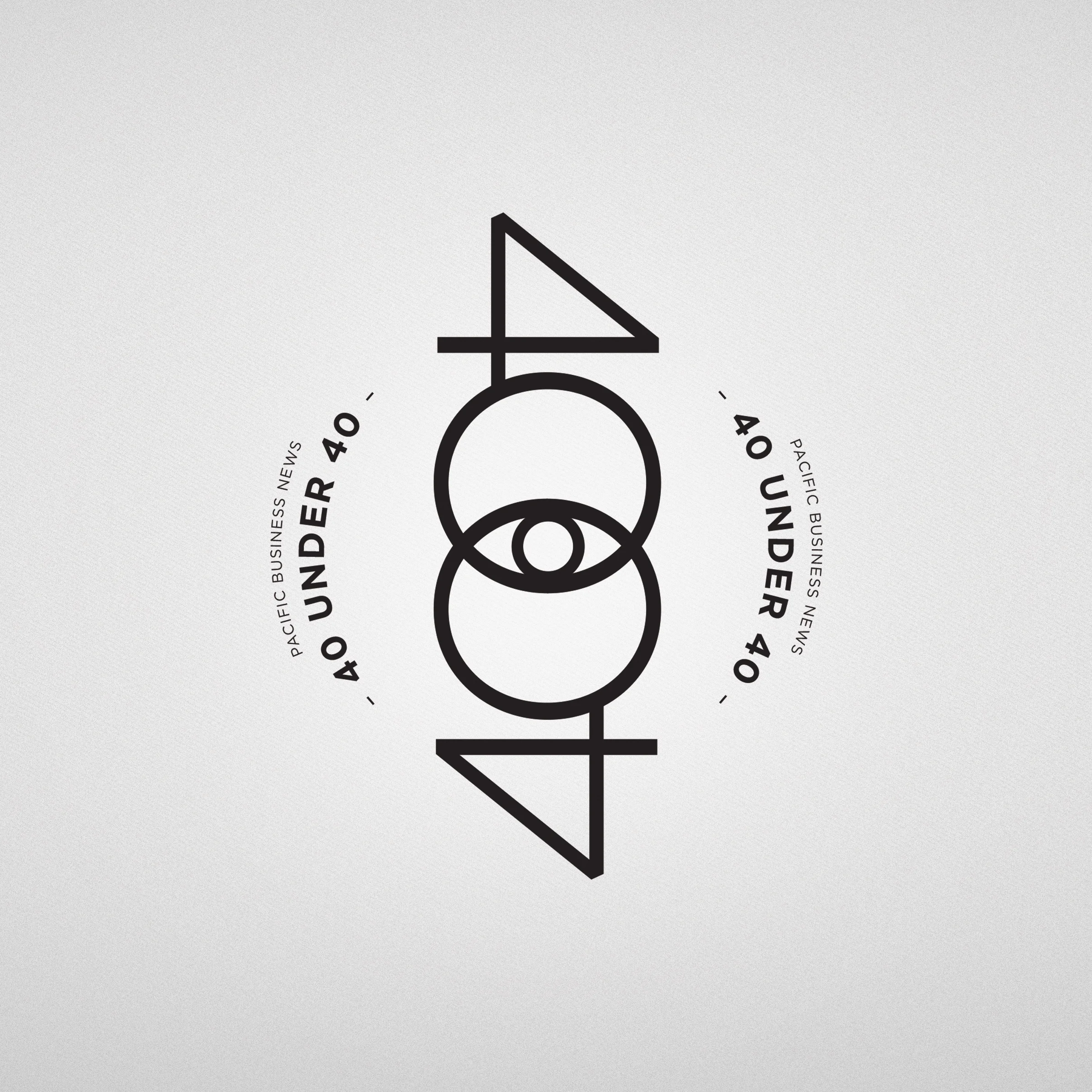
The all-seeing eye emerged as the anchor for the logo — a motif that appeared consistently across the references and carried the right sense of mystery and significance. Rather than treating it as a separate symbol, I integrated it directly into the “40” letterform, making the mark feel like it had always existed somewhere in the archives of a very exclusive organization.
Once the logo was finalized, the rest of the visual system clicked into place naturally. Parchment textures, redacted type, worn edges — the supporting elements reinforced the concept without needing to explain it. That same language carried through the full campaign: teaser ads, announcement ads, signage, and the event slideshow, building tension and intrigue from the first impression all the way to the room.