
40 Under 40
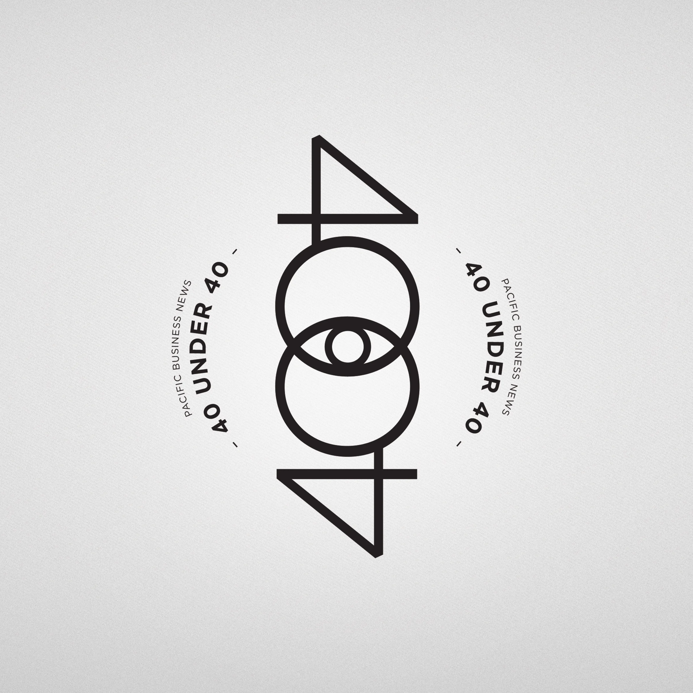
This years 40 UNDER 40 concept was initially a “exclusivity.” I refined it to the exclusivity of a secret group/secret society.
I went and looked at a lot of secret society, illuminate iconography and symbolism. I didn’t want to lean to far in that direction, just a hint of it, but still with a contemporary feel. I developed the logo to incorporate the “all seeing eye” as that was a common theme in a few of the groups. After the logo was finalized the look of at accompanying pieces just fell together. Parchment paper texture, redacted text, it all fell into place.
Once I had settled on the look, I took that concept and worked it through out the entire campaign. From the initial teaser ads, announcement ad, signage, and slide show.
Design & Concept: wow studio
Artwork: wow studio

